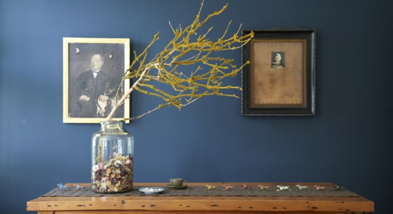
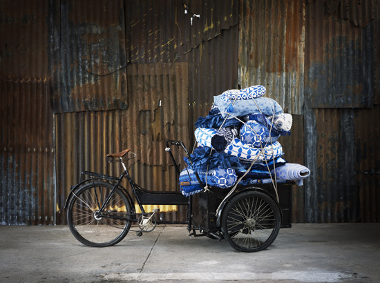
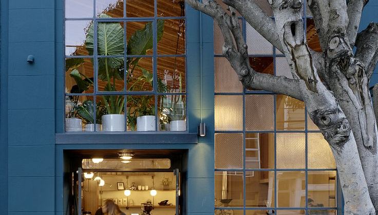
Stiffkey Blue is one of the paintcolors by Farrow & Ball, the sophisticated British paint brand famous for its eco-friendly water-based paints and artisanal hand-printed wallpapers. I have chosen it to be the Color of the Month for February 2016. Stiffkey Blue (created in 2014) is named after the north Norfolk beach where the mud, along with the cockles, is this particular blue hue. It is a moody blue which works in both classic and contemporary interiors. This beautiful color has hints of green and lots of grey which tones down the depth of this deep color. It works well with coral red, soft mustardy yellows and bronze or copper metals.
COLOR OF THE MONTH
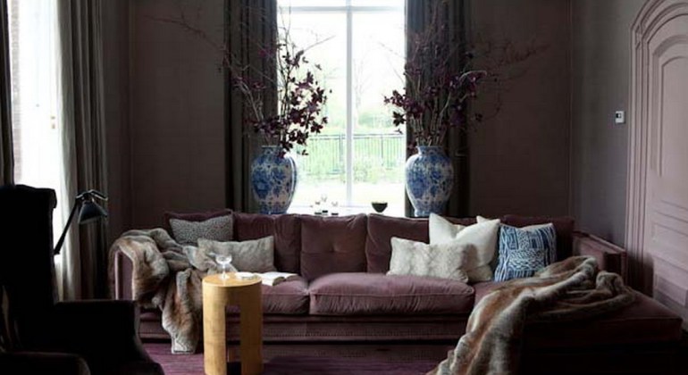
 ubergine interiors feel just right for this time of year. Summer is definitely over and we find ourselves in the middle of the Indian Summer (did you know this name comes from the fact that in the olden days this was the time when the native Indians reaped in their harvest?).
 lassic blue, or True Blue is one of the Top Ten colors selected by Pantone for 2015. The name says it all: it is a classic that will come back again and again. This color reminds me of those true blue summer skies and the mediterranean sea. You can find it in Chinese tableware, Dutch Delfts Blauw porcelain and of course denim jeans.
 int Green is my color for April 2015. It actually reminds me of Guilford Green, Benjamin Moore’s Color of the Year for 2015. And it is similar to Cambridge Blue, the color commonly used for sportsteams from Cambridge University in the UK.
 ell, I have just come back from Switzerland where I did some skiing and enjoyed some highly needed R&R in the spa. Lots of fresh snow, unfortunately not a lot of sun…. and after this overdose of winter white landscapes, snowcapped mountains and wooden chalets I am now definitely ready for spring!
 s you may have noticed, for me the Color of the Month Violet is IT. I have changed the color of my logo to a violet shade, and I have used the color in my latest visuals as well. This cool shade, somewhere between blue and purple, speaks to me in this cold time of the year.
 erulean blue is a muted color, ranging roughly between blue, cyan and green. Cerulean stems from the Latin word “caeruleus” which means heaven or sky. In the artworld, the pigments for this beautiful color were only developed in the 1860’s. Impressionist painters like Claude Monet or Eduard Manet started using this color a lot in their paintings for skies.
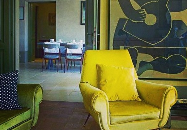
 o me the color of the month, mustard, reminds me a bit of the warm summerdays which are unfortunately behind us now. But the richer tones of this color are perfect for fall, warming up your interior and reflecting the color spectrum of fallen leafs which we will soon see again in all the parks and forests. So here’s a collection to get you in the mood for fall, enjoy.
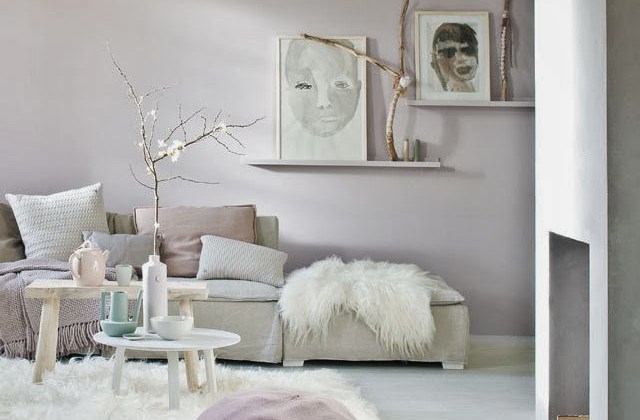
 he color of the month pink is it! And this is my advise to all the macho men out there: don’t be scared of pink! I know, I know, the first thing one tends to think of with pink is Barbie and My Little Pony…. but pink can actually be a very sophisticated and warm color. Combined with other pastels it will be soft and feminine, combined with dark grey it will be quite classy.
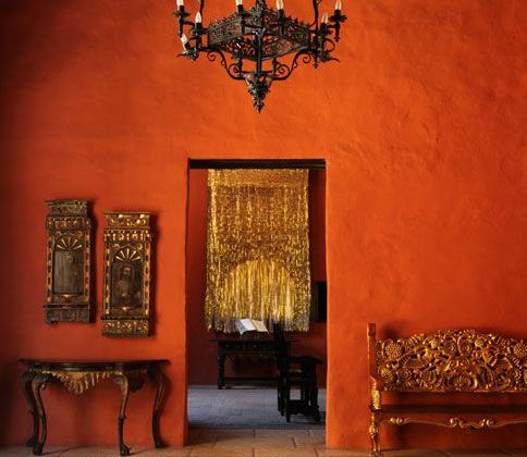
 f you are, like me, longing for summer to begin, here’s a little Color of the Month: ORANGE inspiration. Just to get you in the mood… Colors such as blue, lilac and fresh apple green are probably more suited to this time of year but I just couldn’t resist the warm glow of the orange-themed images I found on the net. Since my post on Wonderful Wicker, I am definitely in the mood for those long summerdays.

