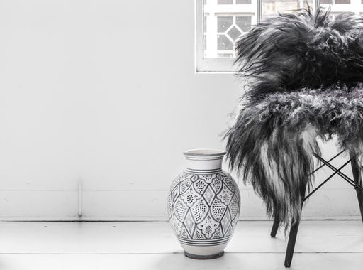
 heepskins are so perfect for these cold December days, especially for the shivery types like myself. Draped over a chair they add a lovely warmth and softness to your back. Spread on the floor next to your bed they keep the early morning iciness from your feet. Added as a lining to a pram will keep your baby warm, soft and sleepy (yeah, so you can do some shopping!).
PANTONE MARSALA RED: COLOR OF THE YEAR 2015
 or years now, the Pantone Color Insitute has selected a Color of the Year that would, according to them, reign in the design world for the next 365 days. In 2014 it was Radiant Orchid, a shade of Lilac that was seen as the symbol of economic recovery and optimism for humanity.
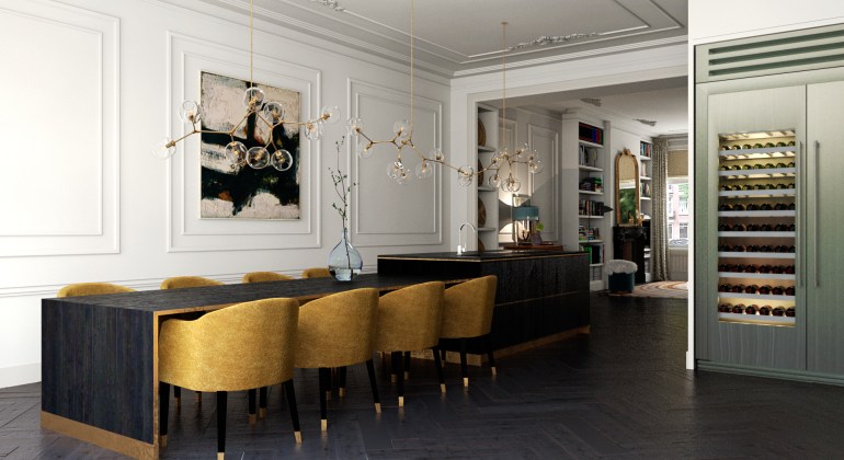
 t has been a while since my last post. I have been very busy with my “real” job, making computer-generated visualisations for interior design projects. I thought it would be fun to post some of the latest results of an Amsterdam townhouse here today. It is a design for a typical Amsterdam-Zuid townhouse. These houses were built around 1900 and are usually about 15 metres deep by 6 metres wide.
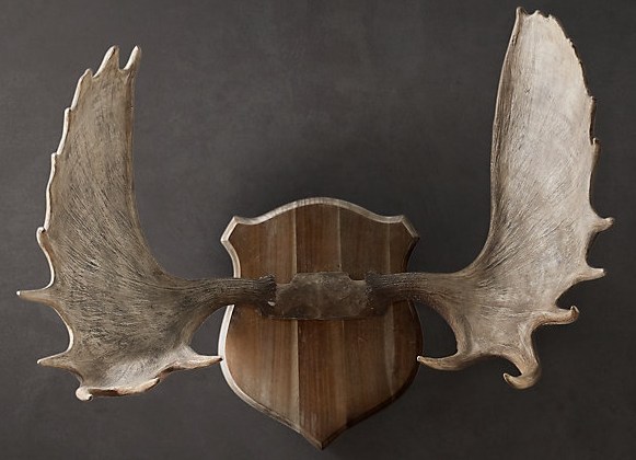
 know, antlers mounted on the wall are a favourite design staple of many designers and stylists. Especially with christmas nearing, I’m sure we will see them around a lot again. But I think we may have seen enough of them. When this trend hit interior-land a few years ago, it hit hard. Antlers mounted on the walls of country houses situated in hunting territories are an obvious choice. The same goes for wooden ski-chalets in snowy mountainous areas.
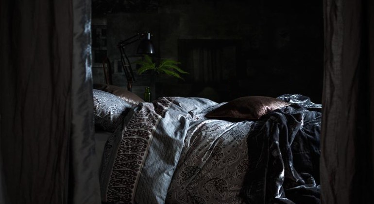
 ark bedrooms: according to my top-post Dark Decor we are all in the mood for a bit of darkness. Dark bedrooms may seem gloomy, but I think they’re very fitting for this season of dark days ahead of us. And don’t be afraid of the dark, total darkness is best for a good night’s sleep.
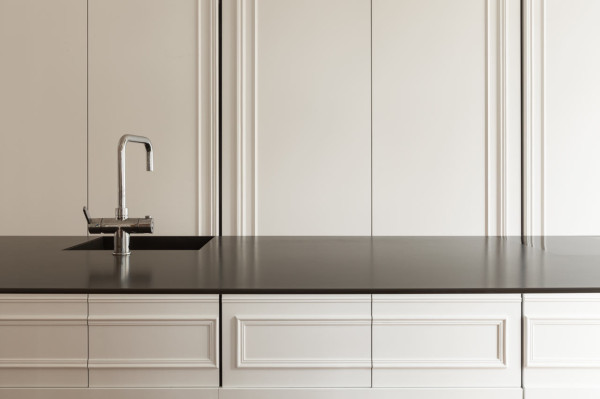
 inimal or industrial kitchens – cool, elegant and bare of distracting titbits – work so well in old buildings. The straight, angular lines of 21st century minimal kitchens contrast beautifully with the ornamental plaster ceilings and decorated wall panelling that were “de rigeur” in the 19th and 18th century. Just like my earlier post on the modern-classic mix, the one enhances the other.
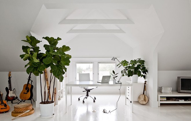
 he Fiddle Leaf Fig has been the go-to houseplant for designers for a while now. And if you are not crazy about the currently very trendy succulents and cacti (of which more here), Fiddle Leaf Figs are ideal for adding another touch of green to your interior. The Latin name for this native to Western Africa is “Ficus Lyrata”. It has earned its nickname because of the broad, glossy leaves that resemble a fiddle.
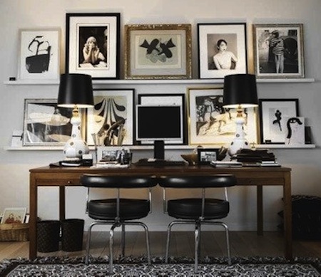
 allery walls can be a great way to display your art. Consisting of a delicate balance of mismatched-organisation, you have to be careful not to make a mess of it. Ideally, gallery walls will grow organically, starting with one piece and adding to it over time. But if that is not the case, certain guidelines apply if you want to do it right:
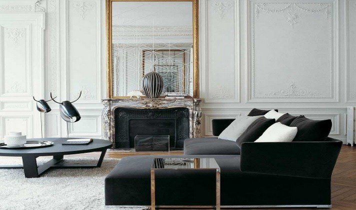
 lassic Modern Mix, don’t you just love this combination? This mix of modern designer furniture in classic, light and old buildings? Imagine a room with white-washed wall panelling, high ceilings, a marble mantelpiece, an antique guilded mirror and so on. This room would look stuffy and boring with matching period antique pieces alone, wouldn’t it?
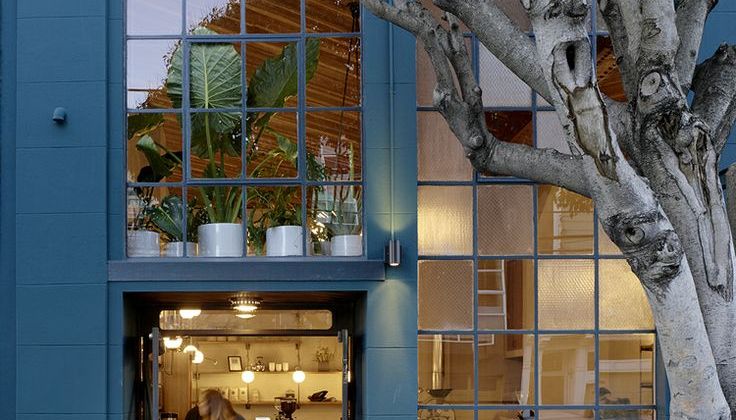
 erulean blue is a muted color, ranging roughly between blue, cyan and green. Cerulean stems from the Latin word “caeruleus” which means heaven or sky. In the artworld, the pigments for this beautiful color were only developed in the 1860’s. Impressionist painters like Claude Monet or Eduard Manet started using this color a lot in their paintings for skies.

